by Genoveve Serge, Guest columnist on the Ventura County Star
In Southern California homeowners are continually moving or upgrading their homes. On a complete home remodel it’s even more important to think of where your dollars can best be spent for a maximum return on your investment.
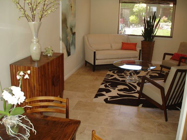
Chairs bring in the Danish style of clean lines and an acrylic coffee table was used to add drama. The natural elements in the zebra wood chest define the space between living and dining room.
Aesthetic appeal for future resale value should always be a top priority.
Photographs shown here are of a modest investment home located in Ventura County. The new homeowner purchased this vacant property which needed a complete overhaul. Too much to tackle on her own, she called me in for direction, planning and coordination with her contractor.

Chairs bring in the Danish style of clean lines and an acrylic coffee table was used to add drama. The natural elements in the zebra wood chest define the space between living and dining room.
At the top list of priorities was how to make the 1,600 square-foot traditional home look and feel larger than its actual space. To achieve this we started by removing the old carpeting throughout the house and replaced it with all natural materials (travertine and walnut flooring). The light reflective quality of these surfaces added volume to every room and are a neutral base for any décor. This is important when choosing hard surfaces, for resale value. Natural stone and hardwood floors also add warmth and contrast.
The ceilings were only 8 feet in height, much lower than today’s standards. The thick texture on the ceilings also caused the rooms to look too top heavy. The texture was removed and all ceilings were smoothed and finished with a creamy white alabaster color. Color palettes are critical in small spaces. They also can dictate the direction of style. In this case the client wanted a more modern feel for her home with clean lines and splashes of bold color.
I’m huge on uncluttered and unobstructed views. Visual peace means less is better. Careful planning played an important role in the scale of furniture to be used. Homeowners often purchase furniture too large or too small for their homes which can create either a cluttered feel or in the case of furniture which is too small, a feeling of empty space. This living room combines traditional with modern. An acrylic coffee table was used to add drama as well as keeping the expresso/cream colored area rug unobstructed pattern. The natural elements in this zebra wood chest define the space between living and dining room. A Japanese elm side table was custom sized to accommodate four for dining. Chairs were found in a vintage store off Melrose Avenue. They incorporate the Danish style, known for clean lines. Strong color choices are used in both the red crackle mirror and pendant light fixture. The homeowner fell in love with this piece of modern art so we decided to make it a focal point in the front room. Accessories tie a space together and create interest.

This modest investment home located in Ventura
County needed a complete overhaul.
We opened up one small bedroom and added French doors out to the patio. This created a master suite which the home did not previously have. The demilune steps were added and designed to repeat the pattern in the exiting patio wall which was also made of brick. In mixing contemporary with traditional styles a custom chaise lounge was designed with acrylic legs. The faux suede on the chaise also is a very durable fabric.
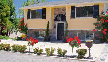
Curb appeal is an important consideration when purchasing a fixer upper. The exterior color was selected to compliment the architecture of the home. An existing front door was painted black and wood shutters were added and painted black as well. We played with various colors before deciding on this perfect shade of butter cream for the wood siding. A great local nursery, Green Meadow on Santa Rosa Road, helped the homeowner with plant selections and placement. A spectacular garden was created which finalized the look.
It is so rewarding to work with receptive clients who trust your expertise and are open to new ideas. The mutual agreement creates a home to enjoy as well as a maximum return on their investment.
SaveSave
SaveSave
SaveSave
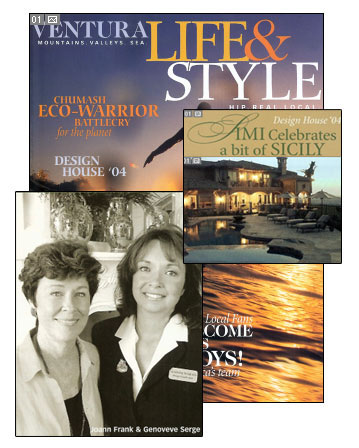 My community involvement in various charitable organizations within my community led me to participate in Design House, Ventura County benefiting the New West Symphony.
